It is used to add buttons in a Python application. These buttons can display text or images that convey the purpose of the buttons. You can attach a function or a method to a button which is called automatically when you click the button.
Syntax:
w = Button ( master, option=value, ... )Here:
master − This represents the parent window.
options − Here is the list of most commonly used options for this widget. These options can be used as key-value pairs separated by commas.
Example:
from Tkinter import *

master = Tk()

def callback():
    print "click!"

b = Button(master, text="OK", command=callback)
b.pack()

mainloop()
How to disable tkinter button: By using "state" option we can disable parameter
b = Button(master, text="Help", state=DISABLED)Align text into button;
b = Button(master, text=longtext, anchor=W, justify=LEFT, padx=2)Some useful options
Anchor=Controls where in the button the text (or image) should be located. Use one of N, NE, E, SE, S, SW, W, NW, or CENTER. Default is CENTER. (anchor/Anchor)
background=The background color. The default is system specific. (background/Background)
command=A function or method that is called when the button is pressed. The callback can be a function, bound method, or any other callable Python object. If this option is not used, nothing will happen when the user presses the button.
font=The font to use in the button. The button can only contain text in a single font. The default is system specific. (font/Font)
fg=Same as foreground.
height=The height of the button. If the button displays text, the size is given in text units.
image=The image to display in the widget. If specified, this takes precedence over the text and bitmap options. (image/Image)
justify=Defines how to align multiple lines of text. Use LEFT, RIGHT, or CENTER. Default is CENTER. (justify/Justify)
padx= Extra horizontal padding between the text or image and the border. (padX/Pad)
pady= Extra vertical padding between the text or image and the border. (padY/Pad)
state= The button state: NORMAL, ACTIVE or DISABLED. Default is NORMAL. (state/State)
textvariable= Associates a Tkinter variable (usually a StringVar) to the button. If the variable is changed, the button text is updated. (textVariable/Variable)
width= The width of the button. If the button displays text, the size is given in text units.
Methods
flash():
Causes the button to flash several times between active and normal colors. Leaves the button in the state it was in originally. Ignored if the button is disabled.
invoke():
Calls the button's callback, and returns what that function returns. Has no effect if the button is disabled or there is no callback.
Canvas Widget
The Canvas widget provides structured graphics facilities for Tkinter.
Syntax:
w = Canvas ( master, option=value, ... )master − This represents the parent window.
options − Here is the list of most commonly used options for this widget. These options can be used as key-value pairs separated by commas.
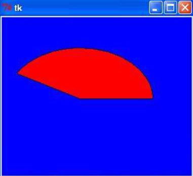
Example:
import Tkinter

top = Tkinter.Tk()

C = Tkinter.Canvas(top, bg="blue", height=250, width=300)

coord = 10, 50, 240, 210
arc = C.create_arc(coord, start=0, extent=150, fill="red")

C.pack()
top.mainloop()
Output:
