In this post, we will learn how to draw the line graph using R Studio.
# Define the cars vector with 5 values
cars <- c(1, 3, 6, 4, 9)
# Graph the cars vector with all defaults
plot(cars)
Output:

Now joining the line using:
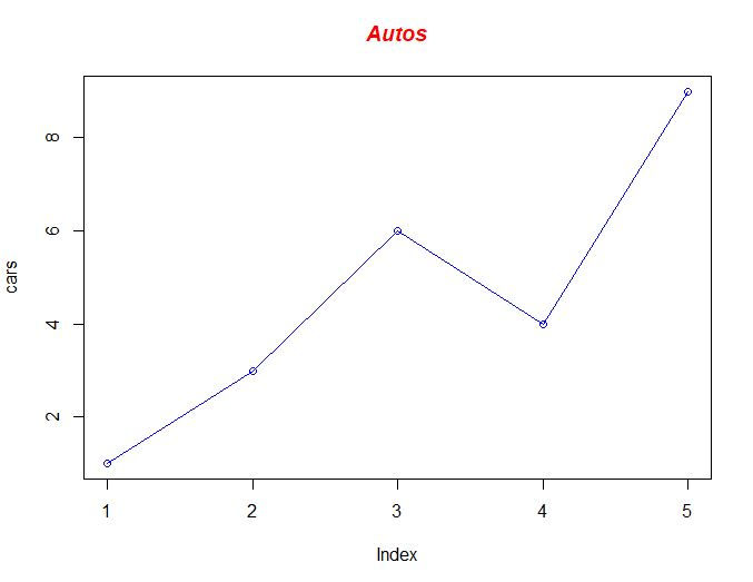
# Define the cars vector with 5 values
cars <- c(1, 3, 6, 4, 9)
# Graph cars using blue points overlayed by a line
plot(cars, type="o", col="blue")
# Create a title with a red, bold/italic font
title(main="Autos", col.main="red", font.main=4)
Output:
Drawing multiple lines
# Define 2 vectors
cars <- c(1, 3, 6, 4, 9)
trucks <- c(2, 5, 4, 5, 12)
# Graph cars using a y axis that ranges from 0 to 12
plot(cars, type="o", col="blue", ylim=c(0,12))
# Graph trucks with red dashed line and square points
lines(trucks, type="o", pch=22, lty=2, col="red")
# Create a title with a red, bold/italic font
title(main="Autos", col.main="red", font.main=4)

Data visualization using the legend
# Define 2 vectors
cars <- c(1, 3, 6, 4, 9)
trucks <- c(2, 5, 4, 5, 12)
# Calculate range from 0 to max value of cars and trucks
g_range <- range(0, cars, trucks)
# Graph autos using y axis that ranges from 0 to max
plot(cars, type="o", col="blue", ylim=g_range,
axes=FALSE, ann=FALSE)
# Make x axis using Mon-Fri labels
axis(1, at=1:5, lab=c("Mon","Tue","Wed","Thu","Fri"))
# Make y axis with horizontal labels that display ticks at
# every 4 marks. 4*0:g_range[2] is equivalent to c(0,4,8,12).
axis(2, las=1, at=4*0:g_range[2])
# Create box around plot
box()
# Graph trucks with red dashed line and square points
lines(trucks, type="o", pch=22, lty=2, col="red")
# Create a title with a red, bold/italic font
title(main="Autos", col.main="red", font.main=4)
# Label the x and y axes with dark green text
title(xlab="Days", col.lab=rgb(0,0.5,0))
title(ylab="Total", col.lab=rgb(0,0.5,0))
# Create a legend at (1, g_range[2]) that is slightly smaller
# (cex) and uses the same line colors and points used by
# the actual plots
legend(1, g_range[2], c("cars","trucks"), cex=0.8,
col=c("blue","red"), pch=21:22, lty=1:2);
Output:

Thanks for reading if you need any types of data visualization help like pie graph, bar graph, etc, you can contact us at given below link
Get your project or assignment completed by R expert and experienced developers and researchers.
OR
If you have project files, You can send at codersarts@gmail.com directly
Comments